Ideas Home
Simple web site about complex ideas.
A Calendar You’ll Actually Love: Designing the Calendar-First UI
Your calendar is the home screen—it should be informative, uncluttered, and intuitive at any zoom level. In this article, we explore how a calendar-first approach can transform discovery and planning.
Simplified, Zoomable Views
-
Month View
Presents a high-level heat map of your activity and mood spectrum, indicating windows with event suggestions without detail overload. -
Week View
Displays clusters of event “dots” or tiles by day-part (morning, afternoon, evening), giving an at-a-glance sense of how your week shapes up. -
Day View
Offers a detailed tile grid: each tile is an event suggestion with title, time, and a thumbnail, allowing quick swipe or tap actions.
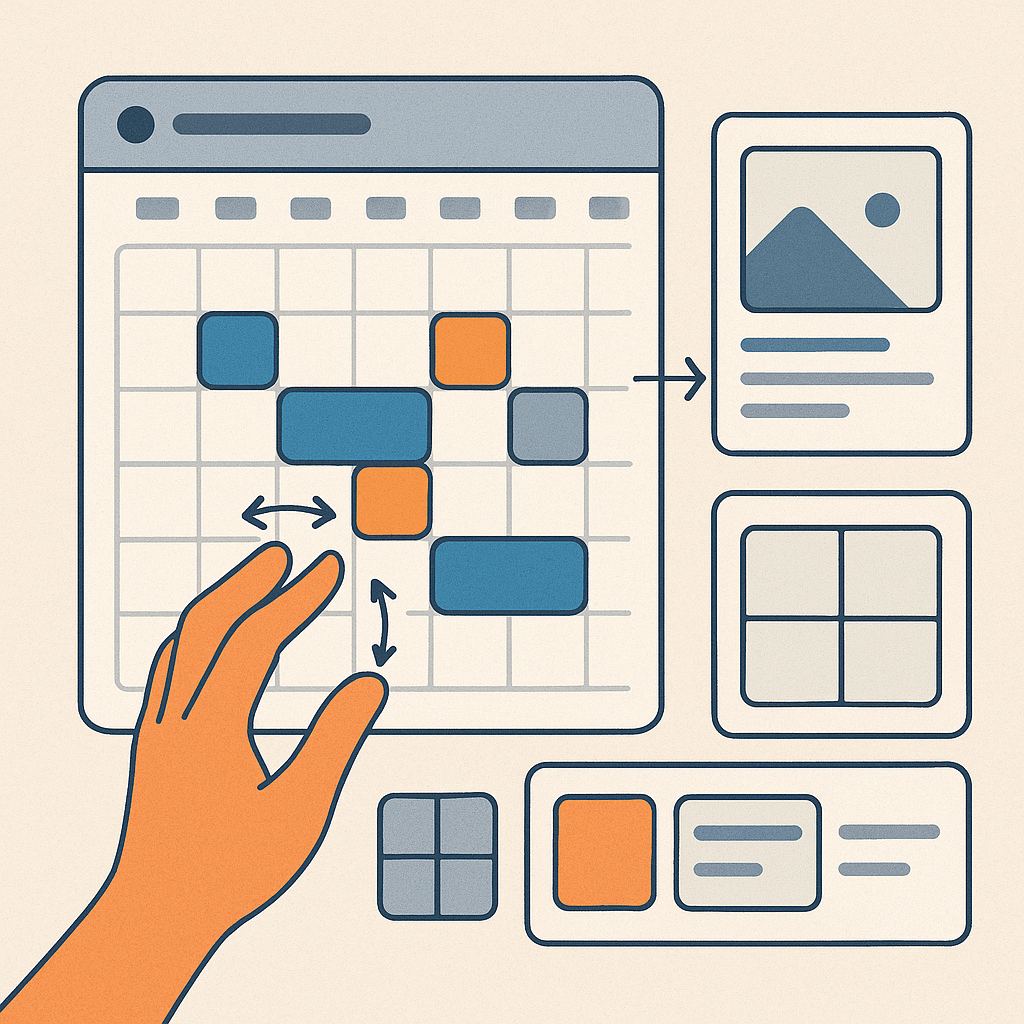
Interaction Patterns
-
Swipe Cards
Pull up an event-card deck for a selected time slot; swipe right to add, left to dismiss. -
Story-Style Snippets
Horizontal carousels for curated collections (e.g., “Top Weekend Picks”), navigable like social media stories. -
Grid Feed
A flexible, two-dimensional grid that adjusts detail based on zoom: minimal overview at the month level, richer tiles when zoomed in to the day. -
Pinch-to-Zoom Navigation
Smooth transitions between month, week, and day views with pinch or double-tap gestures.
UX Principles & Design Rationale
-
Clarity Over Complexity
Prioritize minimalistic visuals and clear hierarchies—avoid tiny pixels or crowded schedules. -
Familiar Metaphors
Leverage patterns users already know (calendars, cards, stories) to reduce the learning curve. -
Fast, Delightful Interactions
Use animations to reinforce context (e.g., a smooth zoom from month to week) and subtle haptic feedback for key actions.